Both artist appeal to the age bracket of 15-25 which is the largest bracket for interest in music. Hadouken attracts their audience by using funky, cool and surreal imagery whereas Asking Alexandria use a simple image of a microphone on the floor with what looks like a metal garage which implies to me it could possibly be the setting of an unauthorised music gig
29.11.10
CD Cover Analysis
The two Cd's i have chosen to compare are Hadouken's - For The Masses and Asking Alexandria's - Stand Up And Shout. Although these two artist belong to different genres of music they both attract the same age range and do it with strengths and weakness'
Location 2 Layout
This is a drawing of the skate park location we are going to be filming the second half of the video.
This is the same drawing but just with annotations of where the actors will be and the paths they will take as we're filming.
Cover Analysis'
For my research i have chosen 3 very different types of music and will analyse their conventions and iconography.
CD 1; Professor Green - Alive Till I'm Dead
The genre of music this artist belongs to is Hip Hop with a bit of Rap intertwined which is clearly resembled by his personal image.
The target audience, simply just from the genre, would be 15-25, male and female, but then looking at the artist, i would say that people up to the age of 30 could be interested. Also by having the 'Parental Advisory' label implies that the music is not necessarily made to connect to the younger teenagers. I think by using the simplicity of a close up of the artist positioned to the right and looking away from the audience add maturity to the music and artist himself which is what will attract the older audience. The little use of green also would attract the older consumers as it doesn't give off the interpretation that the music is bubbly, loud and having no true meaning behind it.
CD 2 ; Hadouken - For The Masses
The genre of music of this artist is New Rave which you can sort of tell by the album cover but it isn't completely clear but you can tell by the surrealism of the earth transforming in to a combination of liquid, glass and what looks like some kind of gas . This image alone would attract consumers because it is different. weird and interesting. Despite the image not totally stating the genre, the font used does. The font is quite futuristic and connotes rave style music. The type of audience that would be interested in this kind of music and artist would be the younger generation of 15-20 and possibly a small proportion being up to 25 years old. The image, effect and font used would tell me that the artist are quite funky and possibly have a typical, scruffy, neon, teenage look to them but still with some severity behind some of their songs.
CD 3 ; Asking Alexandria - Stand Up And Scream
The genre of this album is in fact metal core however the iconography of the album cover does not particularly show this genre. However some of the conventions of this genre do appear on the cover. For example the colours used, dark, black with the titles standing out is commonly used. Also the font of the title is not a clean cut font with a standard plain colour, like other logos and fonts used within this genre the title has extra detail on it, it looks slightly dirty, scratched, ripped and jagged. I would say that the audience of this particular artist and style of music would be maybe 16/18+ to a possible 25-30. I say this because the iconography says to me that the artist are possibly in their early/mid 20's which means they would attract the younger audiences but this style of music commonly lasts for a long while and gain the older generations interest because it's bases is pretty real and most of the time has a message behind it.
25.11.10
Update to Professor Green
Because we are about halfway through the whole process we thought we should update him with our progress.
Beginning Editing Process
In todays lesson the footage we shot yesterdsay was already on our Mac station ready for us to begin the main editing. When looking back on the footage i was rather amazed at how good it did look because as we shot in the evening, while it being quite cold it was slightly difficult to review the footage to see if it was of a decent quality, i.e. if the was in focus. However this fortunately this did not occur and each shot was in focus and of the perfect quality. We also filmed the sun as it was setting, we did this for approximately 20 minutes with the intention of speeding it up to place at the introduction of our video. We did this and sped it up 10,000% which was perfect for the timing when the beat in the song drops. We continued viewing our footage and have completed part of the opening sequence, when watching the edited footage back with the our little Professor Green singing i had the biggest smile on my face because the boy we used, Jimmy, done such an amazing job and when the footage was synced with song the video already looked professional. I cannot wait to film the rest of the video and put it all together!
Homepage Status Update
The changes i made to my homepage, such as the colour scheme, font, and content on my homepage, all help to create a clearer brand identity between my main task and hompage because on my homepage, my banner is a photo of building in london and in the video we film our Professor Green walking alongd the road with houses beside him and when we come to film in the skate park her will also we surroiunded by houses and other buildings. Also the majority of the film is filmed using the night vision filter which also relates to my hompage design becuase the tine of the side it rather dark. By this im refering the the background being black, and the font being a kahki green with some white text.
24.11.10
First day filming.
So, tonight we started our filming and i was so pleased that we had all of our actors, equipment, locations and all the permission needed. I arrived at the media suit at 3:20 planning to leave the school and begin filming at 4:30. Frankie was also at the media suit at that time, we arrived early so that we could meet up with some of the actors and just assure that they were comfortable and enthusiastic about taking part. We collected all of the permission slips off the actors and headed down to meet a few of the other actors in the video. Fortunately one of the actors has a car so he kindly let us put the equipment in the car and drive to the location while we travelled there. We explained in more detail what the children would be doing and how they need to give their role real meaning. They listened so so well and really took on board what we was saying. As soon as we arrived at the location i immediately got the camera out and filmed one of the shots of Lion 1 (Charlotte) walking over towards Professor Green (Jimmy). I was hoping that while i was sooting this footage that the other members of the group would be hastily getting the other children into position but unfortunately the process started a bit slow. But we picked up and began the bulk of the video which is the walk and talk shot of Jimmy. We did as planned and shot a long, mid and clse up of that sequence including the introduction of the Lion's (P.G gang) Also as the song is called 'Jungle' and we wanted to film it as a documentary style we chose to use do the bulk of the film in night vision which looked absolutely amazing on camera so i was extremely pleased with that.
However, there was a rather heated argument between myself and Denzel. I knew we had to be strict with time and had to everything sharpish. For example, as soon as i finished the shot with Charlotte, we should have had the other actors in position, but they wasn't. So when we was filming the first sequence of the walk and talk shot Charlotte wasn't clear on quite what she was doing so i asked Denzel to go through the posture and action she had to perform which could literately be done clearly and informatively in 40 seconds. (I know this because i was able to tell the children, in detail in 40 seconds) where as i mentioned before, time was strict, every second was valuble, there was absoluetly no time to waste, which caused the row because Denzel was taking longer than needed, not saying it is a negative thing against Denzel, but everyoneknew we had to be finished by 6:30 so we needed to get as much done as possible. I was disapointed in myself for allowing the argument to happen especially as the children we present and had to see it. Fortunately myself and Denzel acted appropiately and put it behind us straight away as we was there to do a job and do it well. Also we did not want to waste the actors time as it was quite a cold evening.
Overall the filming went well, we got the bulk of it done and schedualed to complete the filming on the following Monday which, luckily, everyone is avaliable then.
Filming Update
The schedule of filming our video on Friday didn't not go to plan as our actors did not turn up, this was due to our lack of organisation but we made use of the time we had with the equipment because we went out and filmed some of our establishing shots. We got some great shots and was very pleased with the footage we got.
Because we have to film in the evening, so we have darkness, and had organised some actors on Monday, we did not have much more planning or organising to do so we wrote out some ket points, shots and ideas on paper to take out with us. Also during the lesson we rounded up some more actors who will definitely be reliable, unlike the previous group. We began the editing process with some of our establishing shots for the intro. From just seeing the first few shots i got a good feeling about the video. Im very eager to film the bulk of the video and put it all together.
18.11.10
Homepage Transformation
My original homepage layout design has changed, a lot!
I originally didn't want to put the colour green in my homepage as it would be expected however when i was looking over my first homepage design i put myself the the position of the viewers and i didn't think the 4 different fonts colour worked well because there was too much to look at and looked tacky. Also the positioning and detail i had put on there was not necessarily the information that would be on a real site so i decided i need to start again. And i did.
I still used the same conventions as that is what makes a good web page. The changes i made were instead of having text on top of the image, i put the name of tghe artist, 'Professor Green' above the image with the logo next to it and the name of the album below the image. I changed the font as i has previously used 3 different fonts which contributed to the tackyness. The font i chose was called Chi- Town. (below)
I chose this font because it was different and is what i think Professor Green himself would like to represent him. I also chose it because people would associate P.G with graffiti however this was one convention i wanted to break because i do not think that is all he would want to be associated with. This fint is kind of in the middle of the modern graffiti text and smart, neat readable text which i believe represent P.G perfectly. Refering back to colour, i chose to put green on the homepage but chose i more mature, khaki green. My two text colours are green and white as this will not be too much and loose people interest.
Masks
Our masks arrived and i was very pleased with them. Here is Joe modelling the gorilla mask and Denzie modelling the lioness mask.
17.11.10
Location Research
In todays lesson we was unable to film as we needed the sky as it is starting to get dark which is at around 4:30 so instead myself, Joe, and Frankie went and scouted our locations to get a clearer view of the shot through a camera instead of just looking at the setting through our perspective. We took photos of the areas out key shots will be, however we did not show all of the types of shots we did. For example we are going to do a walk and talk shot of our artist singing all the way through but we will be doing in several times as we are going to use an establishing shot, mid shot and close ups from different angles.
10.11.10
Jake Wynn
We was very fortunate to be visited by Jake Wynn, a music video director and editor. He kindly shared his experiences of the media industry. Here are some of the notes i took.
He went to university in Staffordshire and studied TV, Radio and film Studies.
When he left uni he went to begin his career and started as a runner for rushes Post Production Company however edited music videos on the side as that is what he enjoyed doing.
He went on to be a music video editor and edited the Spice girls - Wannabe
<object width="480" height="385"><param name="movie" value="http://www.youtube.com/v/gJLIiF15wjQ?fs=1&hl=en_US"></param><param name="allowFullScreen" value="true"></param><param name="allowscriptaccess" value="always"></param><embed src="http://www.youtube.com/v/gJLIiF15wjQ?fs=1&hl=en_US" type="application/x-shockwave-flash" allowscriptaccess="always" allowfullscreen="true" width="480" height="385"></embed></object>
Jake was awarded a Brit award for the work of this video.
After this achievement he formed a production company with one of his close friends called Jim and named the company, 'Jake & Jim'.
Commissioning Music Videos
Jake took us through the process of commissioning music videos.
1. Video Commissioner ; Get directors by commission.
Send track out to prospective directors with a brief.
2. Director ; Breaks tracks into elements and considers the dynamics of each track.
They also take words from the lyrics but does not stick to them.
A treatment is then written in order to "sell" the concept to the label.
3. The label decides usually in conjunction with the band.
4. Crew ; Camera/DoP
1st Assistant Director
Producer
Editor
Director
Art Department including stylist.
5. Locations, cast, shot list.
No need to storyboard ; just shoot in full takes.
6. Filming (per performance) ; Must have playback
Always shoot; Lead singer
A wide
Whole Takes
Each band member
7. Filming (narrative) ; Shoot as a short film
Consider detail
8. Editing ; Start with the performance because you get the best bits of the band.
Weak spots can be cut away to narrative. These are the performance takes which forms the
performance parts of the video.
Edit narrative separately as one complete story.
9. Final edit ; With detail
10. Online edit ; Special effects etc
He also advised us when making a shot list, make sure you put the most important shots first and the less priority shot after.
As Jake was a music video director and editor we planned to create our own version of a music video he has previously made, which was Robbie Williams - Let Me Entertain You.
The whole class was involved and going to take part in every role, for example i would take a turn being in front of the camera, behind the camera and directing. The class got dressed and made up as wild rockers to fit the theme of the film. Everyone looked amazing and so in character. We used the school's hall as it was big with a stage and looked like a real performance venue. As i am quite a shy person i didn't really want to be in the performance however my career aspiration is to be a camera operator so it still worked out because i had the chance to be in control of each of the cameras. So i was on the main camera doing the wide shot, the little hand held cameras that capture particular areas of the stage and band members and the dolly shot which obviously we had to improvise and use a wheelchair. It worked very well as a dolly though so i was pleased with the footage i took.
I definitely learn't tips and general information to do with filming and what to look at when creating and producing a film whether it be a music video or feature film.
Shot List Production
In stead of creating a storyboard using images we decided it would be easier to organise the order of shots is we wrote it in a list form as when producing a shot list for another of my films, i found it extremely clearer and easier to work out where i am and what type of shot is next.
I wrote out the list with my peers but did not write every shot we wanted because as a film producer you know you will not always stick to that order. There is always extra shots you want to put in once you have seen the footage together. So we only put down the main, key shots we know we definitely want in the video. Most of our film is going to be a walk'n'talk shot of Professor Green anyway, of course using different types of shots, but other shots we put down included shots such as establishing shots, depth of field shots and changes of location. We also wrote down the timings of when and how long we want each scene and shot. This will make the filming and editing process much quicker and easier.
This is the shot list we drew up.
Actor Consent Forms
The whole of our video is going to be shot outside in which means as we are going to use children in our video we will need to write formal letters asking for permission from their parents to take them out of their lessons and to be in our responsibility. Also some of the filming will be done in the evening which means we will make sure we mention on the letters.
Here are some of our completed consent forms.
and this is the extended form to inform the actors parents of another day of filming is needed.
Props - Masks
As our film is called 'Jungle' and is representing children on Hackney growing up to act like animals we are going to use animal face masks. As a group we all immediately thought of having Gorillas as they are the most common animal representing a jungle. So we looked on Ebay and Amazon for gorilla masks and found theses amazing looking rubber and fur masks which have a removable jaw. The removable jaw wasn't originally a necessity but i think we can create something quite funky looking. For our second animal, we found it quite difficult to choose because one member of the group wanted wolve masks, another wanted pigs and the another wanted lions. However after a short discussion the group decided to go with lion masks, despite the chosen masks being lioness' because both the gorilla and lion are strong contenders for the title as the 'King of the Jungle'. I think this was the right choice because people will recognise this link and will maybe get interactive and chose a side they want to support.
8.11.10
Title banner continued..
The conventions i used in my title banner were the obvious, colour, font and image. I decided to use a black and white panoramic image of London's buildings. And instead of using a green colour, like you would expect due to his name, i used the primary colours, red, blue and yellow, and put text on each line and coloured each line. For example the word 'Professor' is the top line and is blue, 'Green' is on another line and is red and the albums name 'Alive Til I'm Dead' is yellow. I decided on a black and white image because it will highlight the text and also is the best way to try and define detail.
The image of London City promotes the artist as he is from London and out chosen song 'Jungle' is about and based in London. The artist is commonly seen in casual clothing such as jeans and either a plain coloured top or something with a small bit of detail so i tried to reflect this in the banner. Hence the black and white image and coloured text.
5.11.10
Web Banner
The software the school had to make the banner was called, Gimp. This programme is a cheaper version of photoshop so it has the same features as Photoshop but not all. As a photography student i am very familiar with Photoshop however when trying to use GIMP, i found it a little frustrating because i did not recognise the icons and know exactly how they worked. I made many attempts to try and create my banner using GIMP but i got too wound up.
So i then went home and searched for a decent web banner creator and found a site called MyBannerMaker and proceeded to produce my banner. This was my outcome;
I was very pleased with my outcome especially as i had limited features such as font and the ability to put links such as Facebook, Twitter and Youtube icons. However i could still manage to do this when i put the banner into the website. I will have to use the banner as an image and add extras such as the links and text to lay over the top.
Incase of this banner not working i am going to produce another on another software that i have downloaded on my own computer called 'PhotoImpact10'. If both of the banners are successful then i will choose the one that i think is the best to promote my artist.
3.11.10
Final idea brief.
I just finished finalising the idea for the video with my peers. I'm really excited about producing this because if we do it carefully then it will be a 1st class piece of work.
We came up with A documentary style video as the song title is 'Jungle' and the song is about how the town of Hackney is not a nice place to live and grow up, it is like a jungle. We was very adamant to use a walk and talk shot as that can create a great effect of viewers. We decided to use children to represent gangs and street rats in which they will represent that their life path is already planned. If they grow up around hackney they are more than likely to fall in with the wrong crowd and be involved in violence and crime. However we are then going to refer the children to the song by using animal masks to highlight the issue that Hackney is like a 'jungle'. This also fits in nicely with the documentary style as there are hundreds of documentaries about animals.
We are going to use many different shots to show the key parts of our film such as establishing shots to set the grimy scene where people have to live and an extreme close up of the artist mouth to highlight what he is saying. A shot i am eager to shoot is an alley scene in the night time showing someone getting beaten. i feel this shot could be very emotional and get a shocked reaction from the audience.
1.11.10
Web page conventions - Brand Identity.
The first web page convention that i have began to produce is the logo. My logo, of a sketched ear, creates brand identity because it is just the image and as our target audience is of the younger ages of 16-25, it will perform its function because the majority of younger people pick more things up visually than literately. For example, the ear has not been used before and so will immediately get peoples attention, they will then find out what it stands for and always remember what it is referring to. Whereas if my logo was just text, the name of the company, people may pay slightly less attention as they need to register their brain to read the words, despite it only being 4 words. Also the positioning of the logo is very key as it is representing the artist and the music. So with this in mind i am going to place my logo on the top right so it will immediately be seen. it will also stand out from the background colours.
These are my logo designs for the production company which everyone in the group will use. We agreed on calling out company 'In The Ear Records'. I also added a artist logo in the bottom right corner.
This was my final logo design that i will be using on my ancillary texts.
Obviously the ear clearly represents In The Ear Records. I chose this design because it is very iconic and people will recognise it and easily refer it to In The Ear Records.
Mood board & web design.
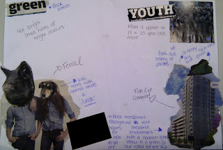
This is my mood board for what i want my web page to briefly entail and have the feeling of. Some of it reflects what will be in the song also.
And this my first initial design of how i imagine my web page to look like.
Subscribe to:
Posts (Atom)